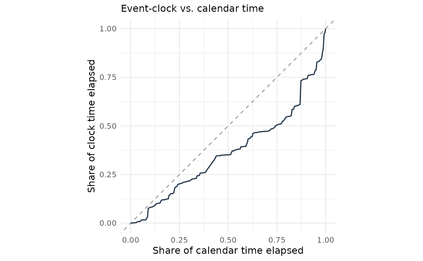
Plots the share of clock time elapsed against the share of calendar time elapsed. The 45-degree line is the "information arrives uniformly" benchmark; a curve below it means information is back-loaded (it waits for the deadline), above it front-loaded.
Arguments
- path
An
event_clock_pathobject fromevent_clock_path()(anevent_pricesobject is converted automatically).- ...
Unused.
Examples
data(us2016)
ep <- as_event_prices(us2016, time = "date", price = "trump",
                      event_date = as.Date("2016-11-08"))
plot_clock_vs_calendar(event_clock_path(ep))